Visualization of a pandemic: Covid-19
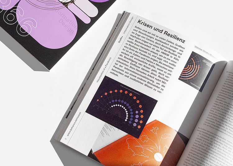
In the course of the coronavirus pandemic, the preparation of statistical data for information purposes has taken on a new significance. What was previously reserved for specialist scientific publications now had to be presented for a mass audience. Svea Hansohn made this the subject of her final thesis and was interviewed for issue 6.21 of “Grafikmagazin” with a focus on information design.
-
Program
MU Cologne
-
Graduate
Svea Hansohn, B.A.
Website -
Title of the thesis
Visualization of a pandemic:
Covid-19 -
Supervision
Prof. Dr. Markus Schröppel (First supervisor),
Dipl.-Des. Ina Kalvelage (Second supervisor) -
Links
Summary of the thesis
At first glance, statistical data is nothing more than that: numbers and units in tables that experts in the respective field of study know what to do with. Svea Hansohn, a Media University Cologne student of B.A. Graphic Design and Visual Communication, wondered how this data could be visualized in a more accessible way.
What can designers do to convey information and data in times of crisis? How can a pandemic be visualized?
She also chose another focus of investigation for her final thesis: What does human resilience have to do with all of this? Whether consciously or unconsciously, everyone has been forced to deal with the issue of resilience in the face of new challenges over the last 18 months.
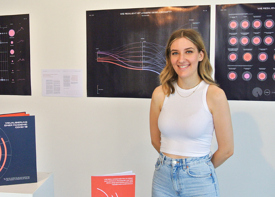
In order to stand out from the sober infographics that we encounter in the media every day, Svea Hansohn has created seven infographics, each covering a different topic area, including global infection figures and vaccination rates. Using an international comparison between six countries, one of the infographics also shows the results of a survey she conducted herself on how resilient society is in times of crisis and during the current pandemic.
Fortunately, despite the pandemic, the bachelor thesis could be exhibited in the Media University’s own exhibition space Galerie Hundert, not far from the Media University campus in Cologne, in summer 2021.


